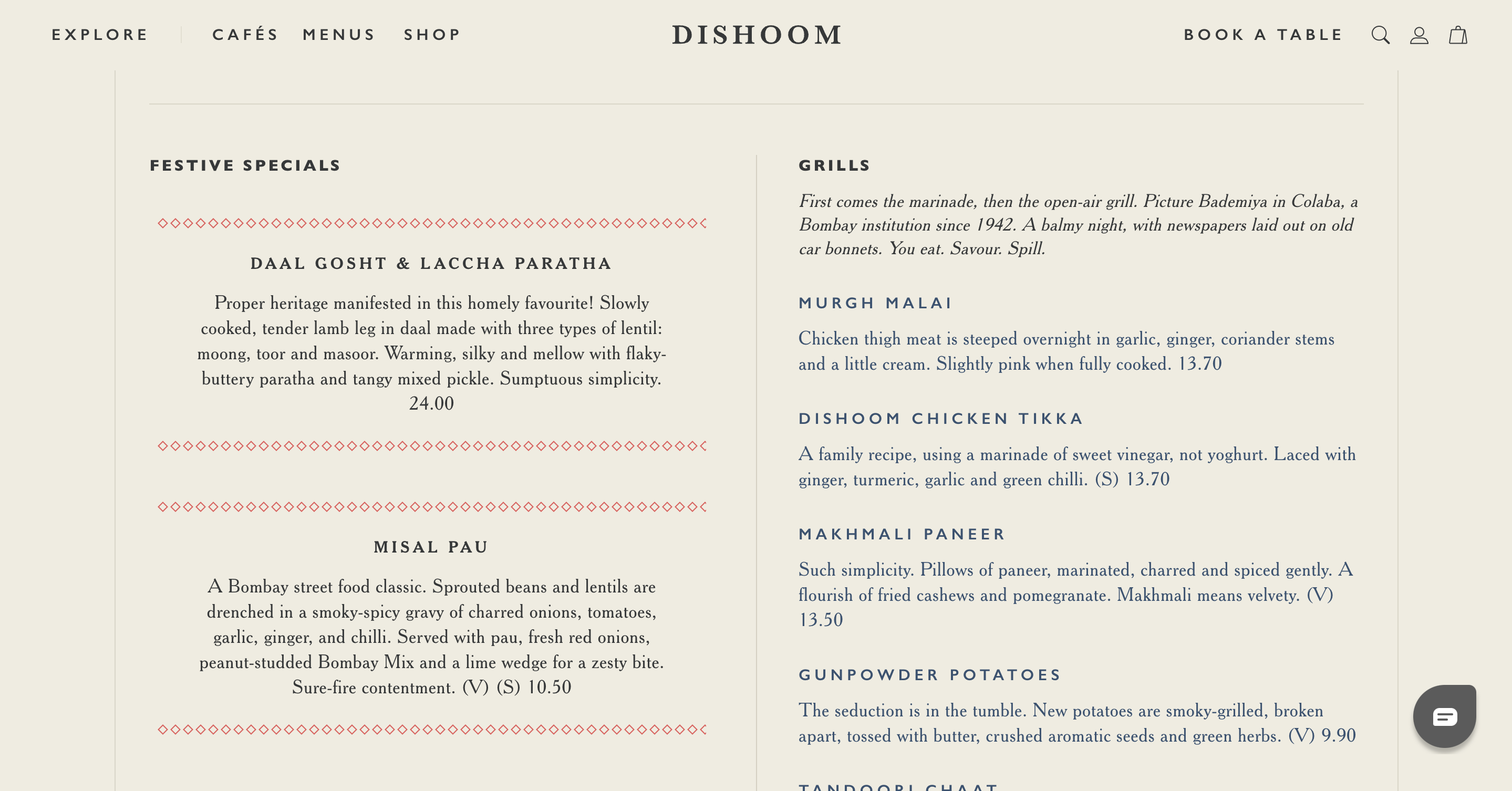
Most people don’t think twice about how a menu is designed. They glance at the offerings, scan a few descriptions, and make a choice. But behind the scenes, a well-crafted menu is a silent conversation between the café and its customers, subtly guiding decisions in ways that feel organic, even inevitable.
Psychologists and behavioral economists have long studied the way people interact with menus, and their findings reveal just how much design influences purchasing behavior. Thoughtful structuring can boost sales by as much as 20 percent, making it one of the most underutilized tools in the coffee industry. From the way our eyes move across a page to the subconscious effect of pricing, color, and language, every detail plays a role in shaping what customers order and how much they spend.
Where the Eye Goes, the Money Follows
Imagine a customer stepping into a café, glancing at the menu. Without realizing it, their eyes are moving in a predictable pattern. Researchers have found that we don’t read menus the way we read a book. Instead, our gaze follows a triangular motion: first landing at the center, then drifting to the top right, and finally scanning the top left. This so-called “Golden Triangle” is where the most profitable items should live—not buried in the margins, but placed where they’ll be seen first.
At the same time, there’s another cognitive quirk at play: the Serial Position Effect, which suggests that we’re most likely to remember the first and last items in a list. A well-designed menu takes advantage of this by placing high-margin drinks at the very top and bottom of each section, ensuring they linger in a customer’s mind just long enough to feel like the obvious choice.
The Language of Desire
If you’ve ever felt inexplicably drawn to a menu item without quite knowing why, chances are it was the wording that did the work. Research shows that vivid, sensory-rich descriptions can increase sales by nearly 30 percent. A simple cappuccino, for instance, becomes far more compelling when it’s described as “a velvety espresso topped with microfoam, crafted from organic whole milk.”
It isn’t just about embellishment; language alters perception. A “locally roasted, single-origin pour-over” commands more attention and a higher price, than just “coffee.” A study published in the International Journal of Hospitality Management found that customers not only preferred dishes with evocative descriptions, but they also perceived them as tasting better. The power of words, it seems, extends beyond persuasion into the realm of actual experience.

The Psychology of Pricing: Less is More
Numbers carry their own weight, and how they’re presented can significantly impact spending habits. A Cornell University study found that removing currency symbols from menus made customers spend more, likely because the absence of a dollar sign made the transaction feel less like a financial decision.
Even the way a price is structured changes perception. Whole numbers,$5 rather than $4.99, suggest quality, while anything ending in “.99” subconsciously signals a bargain. And then there’s the matter of placement: menus that list prices in a neat column invite comparison shopping, nudging diners toward the cheapest option. Instead, the most successful menus subtly weave prices into descriptions, allowing customers to focus on what sounds good rather than what seems like the best deal.
Why Color and Layout Matter
The psychology of menu design isn’t just about text. Even the color choices influence mood and spending behavior. Red and orange are known to stimulate appetite, which is why they frequently appear in fast food branding. Green signals freshness, often used to denote organic or health-conscious items. Black and gold evoke sophistication and luxury. The best menus don’t just inform; they create an emotional atmosphere that aligns with the café’s brand.
At the structural level, effective menus avoid clutter. They use negative space to make selections feel intentional rather than overwhelming. There are no distracting price trails leading the eye away from descriptions, no crowded lists that turn the act of choosing into a chore. The best-designed menus feel effortless to read.
A Tool for Better Business
A café menu isn’t just an afterthought; it’s an invisible hand that steers customers toward decisions they feel good about. The most successful cafés understand that menu design is more than just listing products, but about shaping experiences.
A well-structured menu makes customers linger a little longer, feel a little more excited about what they’re ordering, and ultimately, spend just a little bit more. Not because they’ve been manipulated, but because their choices have been made easy, intuitive, and satisfying.
And isn’t that what a great café experience is all about?


